Wehkamp
An ultimate shopping experience

Wehkamp is the online department store for Dutch families. We helped them realise a complete make-over. A new look-and-feel, a modernized core shopping experience and a brand new check-out flow delivered a stronger brand experience and superb conversion.

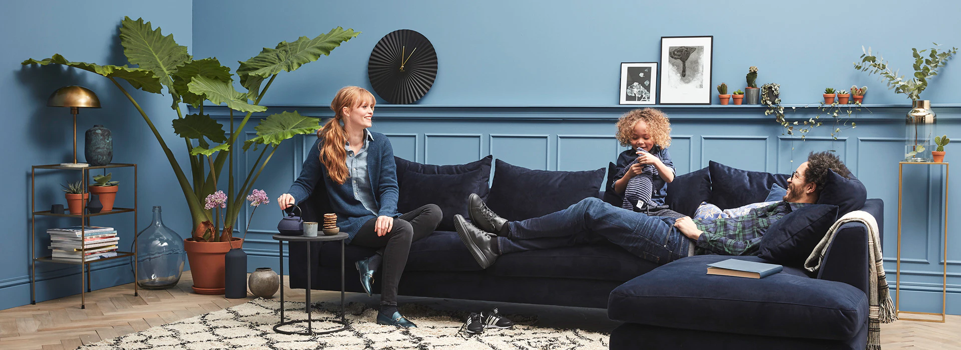
Made for families
Making the life of Dutch families easier and more beautiful. That is Wehkamp's mission. The brand should not only feel as thé department store for families, but also grow within that target group. And mainly focused on the women within the families: the mothers. So it was about time for a rebranding!

Everything mobile first
More than 50% of visitors view the website on their smartphone. A good reason to design everything mobile first.
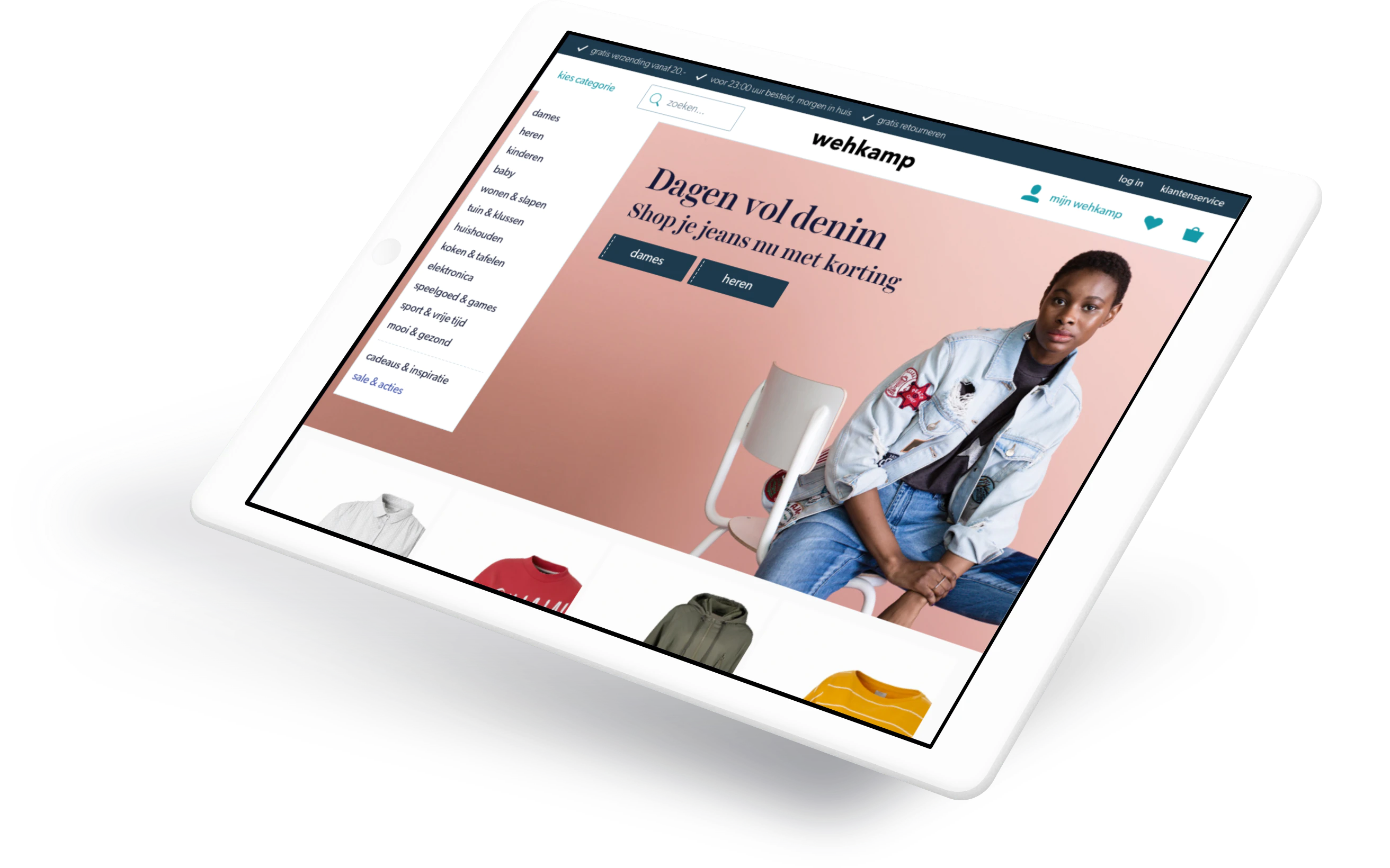
A smooth shopping experience
You can now navigate the website with ease. The presentation of the products has also improved a lot. You can almost feel the fabric of the clothing.

On your doorstep in 3 clicks
From baby clothing to washing machines. With the one-page checkout you order a product in just 3 clicks. And it's in your hands the next day.

You can feel the new Wehkamp in the app
We took the learnings from the online shopping experience and put them to work in the app as well. This way the previously separate shopping and service apps are all merged into one unified experience.
Conversion through the roof
Mobile, tablet or desktop: conversion went way up on all devices. The app didn't lag behind either; the number of active users grew greatly on both smartphone and tablet. All those conversion optimizations were reflected in the revenue. 2017 showed greater growth than the 10 previous years combined.

User centered design is the key
Everything we designed is tested with real customers. In total we held 18 usertests with over 90 respondents. We also continuously validated our ideas with A/B tests. This way we knew for sure if the target audience was actually happy with the changes. Because in the end the ultimate shopping experience for families was most important.
Cases